
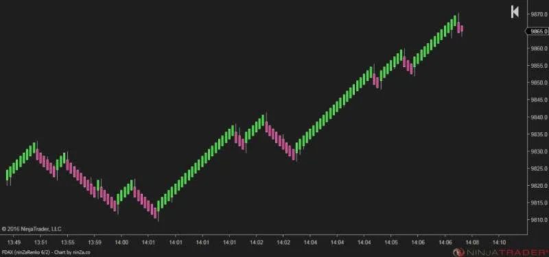
When you open platforms like TradingView or NinjaTrader, you are greeted by a vast array of chart types. The big question arises: "Which chart should I actually use, and what is the real difference?"
Grab your coffee, settle in, and let’s break down how to choose the right lens for your trading strategy.
Every Chart is a Lens Into the Market
The prices are the same, but the representation differs. Ten traders may look at the same market, yet see something entirely different simply because they chose a different lens. There is no "best" chart—only the best chart for the specific task at hand.
1. Time Chart (The Standard)
Every candle represents a fixed period (1m, 5m, 1h, etc.). It ignores activity levels; a low-volume minute and a high-volume minute look identical.
Best for: Session analysis, news events, and traditional technical analysis.
2. Tick Chart (Market Activity)
A new candle forms after a specific number of trades (e.g., 500 Ticks), regardless of time. It allows the chart to "breathe" with the market's pulse.
Best for: Scalpers and futures traders who need to react to execution speed rather than the clock.
3. Volume Chart (Institutional Flow)
Candles are formed based on the number of contracts traded, not the number of transactions. It effectively filters out "noise" and highlights institutional participation.
Best for: Traders who want to see where the real money is moving.
4. Range Chart (Price Action)
These charts only care about price movement distance. A new candle only prints if the price moves a specific number of ticks.
Best for: Trend followers and breakout traders looking to eliminate time-based noise.
5. Renko Chart (Trend Clarity)
Uses uniform "bricks" to represent movement. It hides minor fluctuations, making the primary trend exceptionally clear.
Best for: Visualizing the "big picture" and riding strong trends.
6. Kagi Chart (Shift of Power)
A classic Japanese chart that ignores small movements, focusing only on trend reversals and the balance of power between buyers and sellers.
Best for: Filtering false signals in trending markets.
7. Heikin Ashi (Noise Reduction)
Uses averaged values to create smoother candles. It doesn't show raw prices but makes it much easier to spot momentum shifts.
Best for: Keeping traders in a winning position without being shaken out by minor corrections.
8. Footprint (Order Flow)
The most advanced tool. It shows you the internal battle: buyers vs. sellers at every price level within a single candle.
Best for: Understanding market context, absorption, and true liquidity.
The Bottom Line
Don't ask, "What is the best chart?" Instead, ask, "What data do I need to see?" A trader sees a candle, but a System Builder sees the specific data set required to create a repeatable statistical edge.
Comments (0)
Comments are moderated. Your comment will appear after it's approved.
Comments are moderated. Your comment will appear after it's approved.
Loading comments…